Monday, June 2, 2014

The Poet Laureate of Reddit meets the Artist Laureate

I hate bad poetry.

It makes me almost physically twitchy to have to read or listen to doggerel. The worst crime is when the poet pays no attention to rhythm or natural sentence structure, and does whatever is needed to force every two lines to match. You see this kind of thing on birthday cards, and you hear it at weddings, funerals and company events.

I don't mind blank verse when it's done well, with one of my key requirements being that if you just take out all the linebreaks, something of value has to have been lost, otherwise it's just pretentious formatting. I have a particular liking for well-done structured poetry, though.

The last place you'd expect to see good poetry is on reddit. Reddit is a discussion site where people vote each other's content up and down: content that tickles the "hive-mind" is given more exposure. It's essentially a rather ephemeral, and not particularly literary environment, but significantly better than most web-forums, because the worst stupidity gets filtered out.

There are certain Reddit users who are on a mission, however. Called "novelty accounts", most are stupid, and some are useful. One of Reddit's favourite novelty accounts is the user who goes by the name "Shitty_Watercolour". This user illustrates other Reddit users' comments whenever the whim strikes. Over the years the watercolours have become significantly less shitty, though. Reddit users consider being the subject of a "shitty watercolour" to be one of the highest honours available on the site. Another redditor with a mission is the topic of this article: Poem_for_your_sprog.

Poem for your sprog is actually a really good wordsmith. In response to a simple or profound comment sprog will produce an expertly crafted poem. Sometimes long, sometimes short. Sometimes coarse, sometimes decent. Almost always witty and brilliant, but sometimes just, well, good.  Here are two samples:

I sometimes think I see his face -
The man without a voice.
The man who walks another place,
Divided by a choice.
Perhaps he never made the same
Mistakes across the years -
He never felt an addict's shame
In broken pride and tears.
Perhaps he wed the perfect wife,
And sailed across the sea.
Perhaps he led a better life.
Who cares?
He isn't me.

That's better than most of the poetry I studied at school, and in fact it would not be out of place as assigned reading in a school classroom. This one probably would be, though:

I still recall our perfect start -
That single, precious line.
The moment that I had your heart,
And you, my dear, had mine.
You cupped my cheek and turned my head -
You whispered, 'darling, look.'
You leant in close and softly said...
'ey bb wan sum fuk?'

I try to limit my Reddit usage: I got badly addicted a while back, and have since deleted my account, so that I can only read, and not upvote, downvote or comment. This helps somewhat, but I still read now and again, and every time I see one of these poems, it brings a smile to my face.

Today I became aware that Shitty Watercolour illustrated the same comment that sprog had morphed into verse. The comment in question was this one:

Poverty stricken Uni student, at a supermarket, opened my handbag to pay at the register and a huge fucking moth flew out.
I swear the wing span on that bastard made a "thwock" "thwock" sound as it flew off

Not deeply profound, but it inspired this watercolour:
and this poem:

'Good day!' said I, as pleased as pie,
With overjoyed contented sigh -
'Oh what a shop! Oh what a store!
You've everything I need and more!
You've knicks and knacks and tricks and toys,
And souvenirs for girls and boys,
With gifts and games and trinkets too!
Just look! I filled my basket through!'
The shop-keep sighed: 'Whatever. Fine.
It's yours for $19.99.'
'I see,' said I, and shook my head...
'But all I've got is moths,' I said.

Not actually sprog's best poem, but still way above the normal level of web discourse. The main thing here was that two artists had met. Was it for the first time? I'm not sure - I haven't really investigated deeply enough, but I did find this in Shitty Watercolour's history:

In case that's too small to read, the poem is:
'Hey Mother Nature - what's the deal?
You know, it seems with every meal
I take a bite, then take a breath -
And always almost choke to death!'
Between the fallen leaves from trees
That spun upon a summer's breeze,
Her answer came - a sigh instead.
'Just try to fucking chew,' she said.

I think it's cool, well-written and funny, and yet written in an almost classical style. And the illustration is perfect.

In summary, those two should make a book.

I forgot to mention that Poem for your sprog has now started putting non-Reddit poems onto a blog: http://poemforyoursprog.wordpress.com/author/poemforyoursprog/ 

Sunday, December 22, 2013

Easier focus stacking with Magic Lantern


Magic Lantern is really cool software: it allows you to do all kinds of awesome things with Canon EOS cameras. On Thursday I bought a 600D for Surice and myself, and before Friday I had installed Magic Lantern.

I was particularly interested in focus stacking because I sometimes like to take pictures of very small things. The basic principle is that you first make sure all the pictures are aligned, for example using a tool like align_image_stack and then stack them on top of each other, with the out-of-focus parts of each picture erased. This gives you a composite picture that's in focus all over. Of course, erasing the blurry bits by hand would take forever, so you use a tool like Enfuse to do that.

I've tested it, and it works relatively well. For my test picture, I used three Matryoshka dolls that I got from a Russian colleague.

Here's the standard "depth of field" Matryoshka Doll shot:


That was actually the middle picture from a set of 12, automatically taken one after the other by the camera, due to the magic of Magic Lantern. Normally, I'd look online (like on eduperez's website) for the commands to align the images, but when downloading the files off my flash disk, I saw some .sh files… files containing commands like this:

#!/usr/bin/env bash

# FST_0186.JPG from IMG_0186.JPG ... IMG_0197.JPG with aligning first

align_image_stack -m -a FST_AIS_0186 IMG_0186.JPG IMG_0187.JPG IMG_0188.JPG IMG_0189.JPG IMG_0190.JPG IMG_0191.JPG IMG_0192.JPG IMG_0193.JPG IMG_0194.JPG IMG_0195.JPG IMG_0196.JPG IMG_0197.JPG
enfuse "$@" --contrast-window-size=9 --exposure-weight=0 --saturation-weight=0 --contrast-weight=1 --hard-mask --output=FST_0186.JPG FST_AIS_0186*
rm FST_AIS_0186*


"What does that script do?" you ask: well, because Magic Lantern is written by Free Software geniuses, they gave a nice little GNU bash script as a bonus to their Free Software buddies. I just run that script, and got this:
Quite nice really: all three dolls are now in focus. However, if you look closely, you'll see some fringing or halo effect from the focus stack:

This comes from the algorithm that's erasing the out-of-focus areas not quite working perfectly. I found that someone had solved a similar issue by adding the parameters --gray-projector=l-star --contrast-edge-scale=0.3 to the command line - now while writing this up, I stumbled on Patrick David's blog - he explains how it works, and also introduces the GUI for Enfuse. Enfuse is pretty sophisticated software with lots of options: I'll have to RTFM to see what I can find out to make it work better.

Of course, in this case I could have achieved this effect by just selecting a very small aperture and a longer shutter opening. That's not always possible, though: sometimes you can't get everything in focus just by stopping down your aperture, and due to diffraction the resolution of a lens also gets worse if you stop it down too far, so focus stacking is still useful in these situations.

Tuesday, September 10, 2013

A cheap lightbox for photographing small objects without shadows

Last week, I decided to make a lightbox for the lab. Not the kind where you have lighting from below to look at negatives or slides, but the kind which can light an object from all sides, so that you can get clear photographs.

To do this, I bought a white LED strip and a transformer from the local hardware shop for R400. The LED strip is backed with adhesive, and all the LEDs are connected in parallel, in groups of 3.
The reel with the backing strip covering the adhesive.
The leftover lighting strip still on the reel

The LEDs are connected in parallel in groups of 3
This means that you can cut the strip at any point between two groups of three LEDs, and it will still work. Also, if any one LED fails, the rest of the strip still works.  This is what a working unit of three LEDs looks like:

Unlit, on my laptop keyboard for scale

All lit up!
This made the construction of the lightbox trivially easy: Cut a small hole in the side of a plastic box; feed the cable through the hole; stick the lighting strip in a spiral around the inside of the box; connect the contacts to the transformer, and cut a large hole in the base of the box for the camera lens to poke through (OK, that was a bit of a cosmetic failure, because the plastic shattered while I was cutting it. Clumsy!)

Here is the completed lightbox: you'll see that I put some paper inside it, so that there would be no harsh reflections from the LEDs.


Here's a picture of some shiny candy taken with and without the paper diffuser:


The effect with all those little lights is quite pretty, but it can be distracting.  Also, the complete absence of shadows is a bit strange.  I'll have to experiment with casting intentional shadows (e.g. a black piece of paper at one side of the lightbox?) and with different backgrounds (a 1 cm grid for size reference? a solid black background?)

The light is pretty close to a neutral white: I didn't actually measure the spectrum, but because it's not identical to daylight or fluorescent light, I used a white sheet of paper to set my camera's white balance before taking pictures.

Finally, here's a test picture I took of the previous Chocolate Eclairs packaging (because I had one lying around):
If you look closely, you'll see that the background that I used was a piece of paper with printing on the reverse side: lazy, I know!  Still, I got a well-lit picture with light coming in from all sides. Proof of concept done!

Saturday, July 6, 2013

Smoking Booze

In the ultimate example of misguided health-consciousness, Skippy62able on YouTube decided he needed a way to get hammered without getting fat. His genius idea? Inhaling!

What he does is a boozy version of a classic school-level science experiment: pump air into a bottle with a bit of water in it, swirl so that the air gets saturated with water vapour, and suddenly release the pressure. The resultant drop in temperature makes water vapour condense to make fog. He does this with alcoholic beverages, and then inhales the vapour. He claims to get very drunk in the process.

Now, there is some validity to the concept of huffing alcohol to get drunk. As I've just pointed out in Wikipedia, your liver gets a chance to remove some of the alcohol that you drink before it gets a chance to addle your brain. If you breathe it in, however, it gets absorbed in your lungs, goes back to your heart, and then to your body and brain via the aorta and carotid artery, respectively. Theoretically, you'll get drunker faster off the same amount of alcohol if you inhale it.

Of course, you won't dodge all the calories. According to this article, alcohol contributes a very significant part of the energy of most alcoholic beverages. For example, most of the energy from a beer comes from the alcohol, even though it still contains some carbs. Even though you might sweat and pee out some more of the alcohol because it bypasses the liver the first time around, you'll still metabolise most of it.

The actual demonstration is completely fake, for a number of reasons.

First, although the pressure release cause some dramatic vapour, all the air that escapes the bottle is booze that you lose. If you really wanted to get all that ethanolic goodness, you'd want to inhale the escaping air.

Second, he only takes one hit from each drink, leaving most of the alcohol still sloshing around in the liquid phase!.  Even if he were to inhale all the vapour from the bottle, he really wouldn't get much out of it. Let's see what the maximum would be. A very generous assumption is that the vapour is in equilibrium with the liquid when he inhales it, so the amount of alcohol depends on the concentration in the liquid phase.  Let's see:
  • Beer - about 5%
  • Pre-blended alcohol/energy drink  - up to 12%
  • Champagne - maybe 15%
  • Vodka and tonic (about 1:2, guessing at flow rates) - about 40/3 = 13%
  • Whiskey and cola (about 1 to 1) - about 20%
  • Branded RTD beverage - about 5%
  • Box Merlot - about 13%
  • Branded German herbal liqueur and energy drink (about 1:3) - about 35/4 = almost 9%
calculated the amount of ethanol in the vapour phase, using vapour-liquid equilibrium from Chemsof.  By my calculations, each time he gets only about 5% of a gram, assuming he can breathe in about 1.5 L each time, and it's all absorbed by the lungs.  In the end, he gets less than a tenth of the alcohol that he would have gotten from one shot of that Vodka.

So how do you explain his "saturated" breathalyser?  Very simple: he either drank alcohol during the camera breaks, or else he held some alcohol in his mouth while breathing over it.

Now what would one do if one wanted to get high off alcohol without drinking it?  My immediate idea was something like a hookah.  If you could bubble air through booze for long enough, you'd extract most of the ethanol and deliver it to your lungs. Apparently this is not new. Alcohol without liquid sells something similar, and makes some unsurprising claims.  Apparently it takes around 20 minutes of inhaling to get sloshed.

Monday, September 3, 2012

The Garden Statement Part II: Shopping in Whippany

Since I've been living in a furnished apartment, I've had a much more detailed introduction into the US shopping experience than I have in countries where I stay in hotels.

It's not that different from South Africa in many respects. There are the same basic advertising media and retail channels that I'm used to, but there are some subtle differences.

I've been to Target, and it's like a typical hypermarket in South Africa. I bought some basic groceries there on my first day, and although in general groceries are more expensive here, it wasn't too bad. I have a few comments, though. First off, the following products:

The Jif-brand faux-Nutella was slightly cheaper than the branded stuff, and not too bad, but I changed back to the Good Stuff when I realised how small the price difference was. The peanut butter did, in all fairness, say "extra chunky", so I can't really take issue with the fact that it was basically a bottle of peanuts with a bit of peanut butter gluing them together, but as for the tub on the left: it's quite serviceable margarine, but anyone who "can't believe it's not butter" has never actually tasted butter. And, Unilever, don't even think of pointing me at the disclaimer "Tastes as good as fresh butter, according to 4 out of 5 butter users"! "as good as" ≠ "I can't believe it's not". C'est magnifique, mais c'est ne pas la buerre!


Ooh, pretty!  Do these make my feet look big?

A bit later, I went shoe shopping at Target, because my takkies needed replacing. While there, I saw some very nice-looking Swissgear hiking boots, and briefly understood what it must be like to enjoy shoe-shopping. Unfortunately, they were not as comfortable as they looked, so I just bought a pair of sneakers for about $30.

King's is a much higher-tone establishment than Target. There is a King's within a few km of my flat: my closest real grocery store. For my South African friends: it's quite similar to Spar. It was a bit more expensive than I preferred, though, so I next went to my second closest grocery store: Stop&Shop. I was impressed by the fact that you can check your own groceries at a self-service counter, but my colleague Deborah pointed out that they have a further level of convenience:


That's right, you can scan and bag your groceries as you go through the shop, and when you're done, you just pay at the self-service counter, hang up your scanner, and go! No human interaction required (yes, even for that green pepper you see there!) I guess the shop has to trust its customers to an extent for this to work, but I'm not sure how their security is set up to detect fraud.

As for the range of products, they have a few interesting items that I wasn't familiar with:
Celery roots: I never knew one ate anything except the stem!

Half-and-Half: it's half milk, half cream.

Another thing I was only vaguely aware of was how bad US chocolate is.  I'd heard rumours, but until I tasted one of these:
I really had no idea.  I thought it had gone bad: it tasted vile! Then colleague Shelly clued me into the history: apparently American consumers had gotten used to the taste of chocolate made with stale milk, to such an extent that butyric acid is added to much American chocolate to satisfy that expectation!


Now I'm going to talk about advertising, so here's some fair warning:


I was amazed at the varying quality of American TV advertising. Some is great: I even enjoy watching some of the TV ads. just like in South Africa. Some is absolutely terrible:

Seriously, what do a CGI-generated general and a penguin have to do with insurance? And then there are thoroughly corny ads featuring a mutilated song from Grease about "summer savings" on Nissans. And then an ad for my local Honda dealership clued me in. The fact that a small-town car dealership can afford to advertise on Cable TV implies that you can target your ad extremely locally: in fact, as colleague Khyati explained, you can target by zip code.  When you're not paying through the nose for placement, there's less incentive to go the extra mile on production values.

Then there's the outdoor advertising. Africa has, if anything, bigger and more in-your-face billboards than here (probably because of the lower penetration of other media? I'm not sure.) but there were some interesting little billboards advertising local businesses:


Yes, that's right: the Honda dealership had a much cornier outdoor campaign than even their TV campaign would have suggested. They win the prize for the least inspiring Olympic tie-in I've ever seen on any product, with an honorable mention for the greengrocer's apostrophe.


I'd always asssumed that freemasonry was a secret society, and in many places they're frankly regarded with suspicion, but here they advertise right on the roadside, and proudly announce their presence. I suppose nowadays they're much like Rotary or the Shriners.

As far as car stuff goes, there are also a few quirks. Because of the law in New Jersey, I don't get to pump my own gas, so that's much like South Africa, but here you have to check to see what the gas station charges per gallon: it's not all one price! Also, whereas in South Africa you'd never find a petrol station without compressed air available for free to fill your tyres, I couldn't find one single gas station along Route 10 which has compressed air! I had to go to the tyre repair place that has a contract with the rental agency when my low-pressure warning light came on.

While waiting for them, I wandered around and found a shop called (and I'm not making this up, I swear!) "Guidolume". They specialize in lights and clocks. They had walls full of clocks, so naturally I went there to kill some time. They had lots of relatively nondescript grandfather clocks,

but their wall clocks finally brought out the snob in me. They had the level of understatement and sophistication that perfectly suit a pretentious South African blue-collar home. Swarovski crystals and Christmas chimes (shudder).


The cable TV was also interesting.  Just as Danielle had noticed in South Africa, I also found that the "naughty" words had been censored from some of the channels.  But while looking for some nerdy entertainment one evening, I found that for those desperate enough, there are … other options:
Let me hasten to add that I have never and will never buy pay-per-view porn!

Anyway, that concludes my biased and incomplete view of the US commercial space. Next episode: México!

Sunday, August 26, 2012

The Garden Statement part I: Bathroom User Interfaces and Whippany Wheels

I have been living in Whippany, New Jersey ("The Garden State", according to the license plates and that movie with the guy who played in "Scrubs") since mid July, and every weekend, I vow to update my blog, and then I either just laze around or I get taken out to see even more of my new surroundings by my temporary office-mates (and, I hope, permanent friends!)  So I've decided: Instead of trying to write One Perfect Blog Post, I'm going to go with the series approach.  In the next couple of episodes, I'll catch you all up to the present day.

The first thing that struck me on arriving at our Whippany office, was how everyone took a great interest in making sure I felt welcome and had everything I needed; from a birthday card signed by the whole group, to the way my new boss made sure I had everything I needed, and helped connect me to whomever could help, to the colleagues who helped me find my way in the lab and around the area (more details to follow in future episodes!)

I'm not prone to culture shock, so I didn't expect USA to be a strange place, beyond what I'd already heard about it.  I consume popular culture (TV and Internet), so I figured I'd be pretty much prepared.  As it turns out, the surprise was how little different it was from South Africa.  New Jersey is quite cosmopolitan, very suburban, and quite green at this time of year.  (I hear that winter is a very different story.)

There were a few weird things, though.  For example, on my arrival in Whippany, I stayed in a hotel for one night, and when I left I mentioned that they should check the shower, because it was only giving cold water.  When I arrived in my rented apartment the next day, though, I had the same type of plumbing fitting, and I discovered that I just didn't know how to use the tap.  Consider the following two devices:
Bathroom shower

Bathroom sink

Superficially, they seem to have the same user interface, and they're made by the same company.  However, they work quite differently.  To open the tap in the bathroom sink, you pull the knob towards you, and to set the temperature, you turn it left and right.  It's rather hard to set the flow rate, but it can be done.  The one in the shower, on the other hand, has no independent control of flow rate and temperature.  You turn it anticlockwise to turn it on, and if you want hot water, you turn it further anticlockwise.  Go figure.

Another particularly annoying "feature" in the bathroom user-interface realm is automatic-flush toilets.  The plan is probably that you don't have to touch anything in the stall, and won't forget to flush.  The reality is that the toilet flushes when you walk into the stall, because the sensor isn't properly tuned; flushes again if you happen to lean forward for any reason (very disconcerting!) and once more when you leave.  I just hang some toilet paper over the sensor to avoid surprises.

Lincoln Town Car
For the first few days I spent here, I was taken to work and back by a limo service.  They use Lincoln Town Cars, a brand of car I'd never seen in real life, but which I'd describe as big, ugly, stereotypically American cars.

On the second day, we rounded up a posse of highly qualified R&D scientists to rent a car.  Being the frugal type, I selected an ugly little van that wouldn't have looked out of place as a drug dealer's car, but as it turned out, there were a few bits of red tape that the team wasn't used to dealing with from the previous manager.  Apparently his lax attitude was part of the reason why he was the previous manager.

Yes, the number-plate says "AXE".
This worked out in my favour though.  When we came back the next day, the nasty little van was gone, and I got a Ford Focus instead, which I enjoyed, partly because Surice had driven one before, loved it, and would be envious!  It's not bad, but it's an automatic, and a petrol model, so the best I can achieve is slightly above 30 MPG (about 7.8 L/100 km), while I can easily get 5 L/100 km (47 MPG) out of my sweet little VW Polo diesel back home.

The Whippany team also quickly organised a driving evaluation/lesson so that I'd be allowed to drive my new ride, and got me a GPS so that I'd be able to find my way around.  I almost turned into oncoming traffic at one point, but my teacher corrected me, and I was fine for the rest of the drive, so he cleared me for action.  I haven't repeated that mistake, so I guess I'm OK.

Street signs are a bit different from South Africa: you have to read more over here.  Where we'd have a picture of pedestrians crossing a road, they have a sign saying "PED XING", which is apparently not the name of a local restaurant.  Their speed limit signs are much easier to miss, because they're just rectangular black and white signs, so you have to keep a sharp eye out for them.

Jersey drivers (this is actually a rare sight)


I was quite strongly advised against cycling in New Jersey.  It's supposedly not bike-friendly, the drivers are aggressive, and the consensus was that it would be a bad idea.  I weighed up the pros and cons, and started bike-shopping.  Before I got to the point of actually shelling out cash, though, one of my favourite colleagues from the Halls group came to my rescue and lent me a bike, a helmet, a water-bottle and a pump (Thanks, Khyati!), so I started commuting by bike, and I've become significantly fitter!  A trip that took me almost an hour now takes me about 45 minutes.  A good part of my trip is a designated cycle route, I ride on the sidewalks where possible, and I face traffic if I feel unsafe about any part of the ride.  The cops don't seem to mind any of these behaviours, and I haven't even had a close call yet: so far so good!

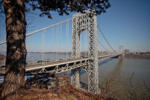
The cyclists in our R&D group are friendly and helpful, and they've taken me along on one mountain and one road biking trip so far, and it's been a blast!  I haven't yet had a chance to take pictures, but the views have been picture-postcard great, for example, the view of the George Washington Bridge from the Palisades Park.  For the road biking trip, a colleague whom I'd only ever emailed a few times before coming here lent me a carbon fiber road bike and cycling clothes (Thanks Tony!), and another contributed pedals (because I don't own shoes with cleats for clipless pedals - Thanks Frank!)

This is the view we saw at the start of the bike trip (not my photo, sorry!)

Look out for my next installment: shopping in Jersey!

Sunday, July 22, 2012

DC Days

So after meeting my colleague Danielle, handing over as much information as I could muster in one day, and a whirlwind of packing and preparation, I finally left for the USA.  I'd been warned about the TSA and the stringent safety measures in US airports, so I was not really surprised.  They really do slow down the queues, though, and I didn't realise that the screening started in OR Tambo airport.
Airport screening in JHB for a flight to JFK
After landing in JFK, I had about 2 and half hours to make my flight to DC, so I was nervous about missing it, but I made it with plenty of time to spare.  DC was a blur.  I landed, took two buses to the international hostel and then somehow got to the venue - I think I walked the 2.5 km. I definitely did this for the rest of my time there; it was simply less hassle than taking the bus.

We had a choice: get the conference shirt for free, or use the credit for anything else in the conference shop.  I opted to get an "I edit Wikipedia" shirt instead.

When I say DC was a blur, I really mean it. I hardly took any photographs. I did photograph the delicious clam chowder I got at Così, though.


Apart from the amazing, stimulating talks I attended, and the valuable meetings we had about Wikimedia South Africa's upcoming WikiLovesMonuments project, one of the main highlights was the OpenStreetMap mapping party.  This year, the unofficial theme was "I map dead people": a tour through the Congressional cemetery.
Why is the organiser the only one not wearing a cool orange Official Open Street Map Surveyor vest?
While mapping the famous graves, I spotted a few inscriptions that I found amusing in a kind of schoolboy fashion:
I'm guessing this guy didn't die poor.

Another tragic victim of the Spam Wars

Soo, do you come here often?

But there were also some more interesting ones, many of which have Wikipedia articles about their subjects, and some who probably could have, but don't.  One interesting example of the former is Ann Royall, Pioneer Woman Publicist. An example of the latter is A-Moose or Little Bee, a Chippewa chief who died of the "Black Measles" while part of a delegation of chiefs being shown around Washington to put the fear of the US Army into them, so that they would not get all warlike again.
What are those little red flags, anyway?
The major output of all of this is that the Congressional cemetery is no longer just a green blob on the map: it's now a pretty good work in progress, and I had a hand in it!

I like the layout of DC: If you want to be on 11th and K, you walk until you find 11th street, change direction and then walk until you find K street.  Easy!  It's also got an interesting street life: lots of homeless people (probably because of the warm weather?) I even got to play some chess in the park after dark with some strangers.  I have never claimed to be a great chess player, and these guys kicked my butt quite thoroughly.

Look out for the next episode, in which I arrive in New Jersey!